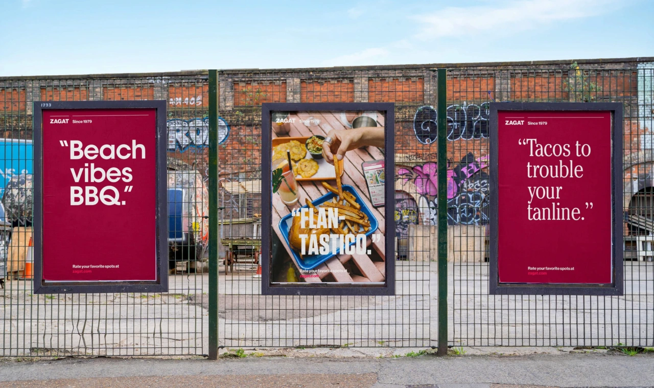
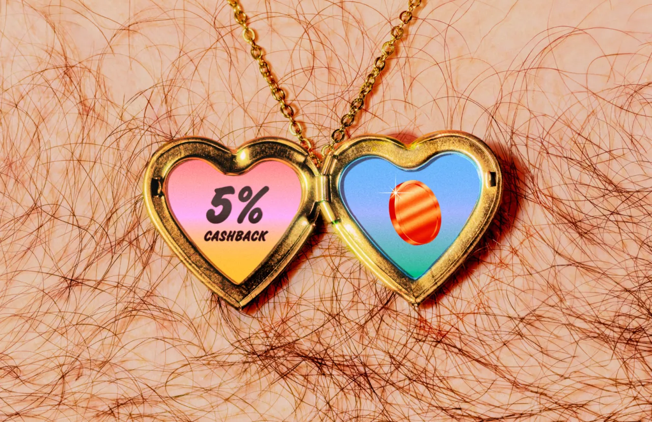
Koto helps restaurant-discovery app Franki make time dance
The global design studio has given the social restaurant-discovery app a warm, yellow-soaked identity built on one deceptively simple idea: make "time" itself dance.
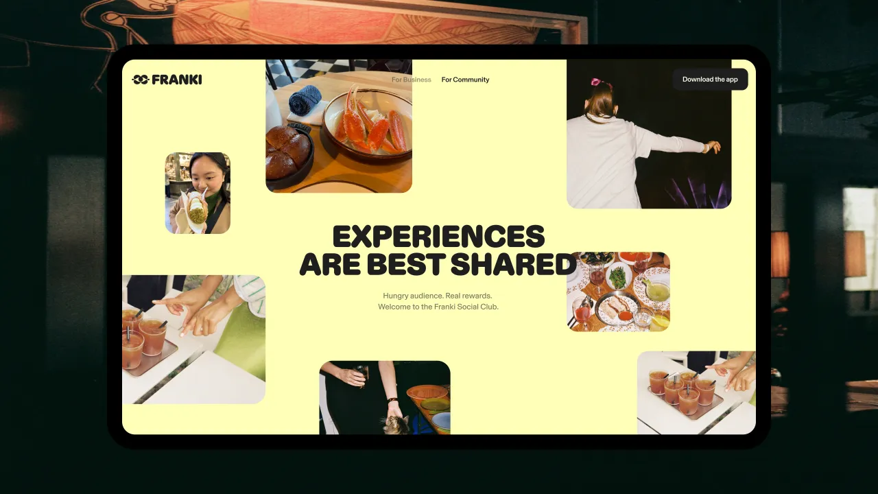
You know that hangry moment? When you're standing on a street corner, phone in hand, three chat threads open, everyone hungry and nobody willing to commit and pick the place? Deciding where to eat has somehow become a modern headache. That's the very dilemma that Franki, a social restaurant-discovery and rewards app, is trying to tackle. And it's just been given a brand to match by global creative studio Koto.
Founded by Eugene Varricchio and Nick Bennett, Franki began in Austin in 2020 before expanding out. The idea is pretty simple: short-form video recommendations from real local diners, a bit of personalised discovery, and cash back when you actually turn up. How it works is you activate an offer, pay with a linked card and earn rewards, then earn a little more when your own recommendation gets someone else through the door.
Restaurants benefit, too. Instead of paying upfront for impressions or clicks, they only pay when Franki connects a piece of content to a real visit and transaction. This makes it a creative alternative to traditional advertising, and it closes the loop between discovery and content, purchase and attribution. (Why didn't we think of that?)
The trouble is, this is a crowded corner of the internet. Franki needed a brand that could hold its own against the likes of Google, Tripadvisor, and Yelp, plus the growing wave of video-first discovery apps, all for the same attention. But here's the trickier problem: how do you sell the joy of an app-only experience before someone's even downloaded it? And once they have, how do you give them a reason to keep coming back?
Turning discovery into a good time
Koto's answer was one line: "make time dance". Because if time is the real currency of the experience economy, the thinking goes, then Franki is there to help you spend it well. It's the insider mate who always knows where to go, when to go and what's worth telling people about. Crucially, it doesn't assume everyone is the same. But every post and recommendation adds something back to the wider community and helps the next person find a good night of their own.
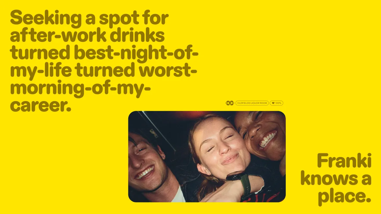
The verbal identity takes its cue from the Jester archetype: lively, open and never too pleased with itself. Franki's voice doesn't feel exclusive (your name's not Dan, you're not coming in). Instead, it has expertise, warmth, wit and honesty. It opens doors rather than closing any.
Bringing it all to life
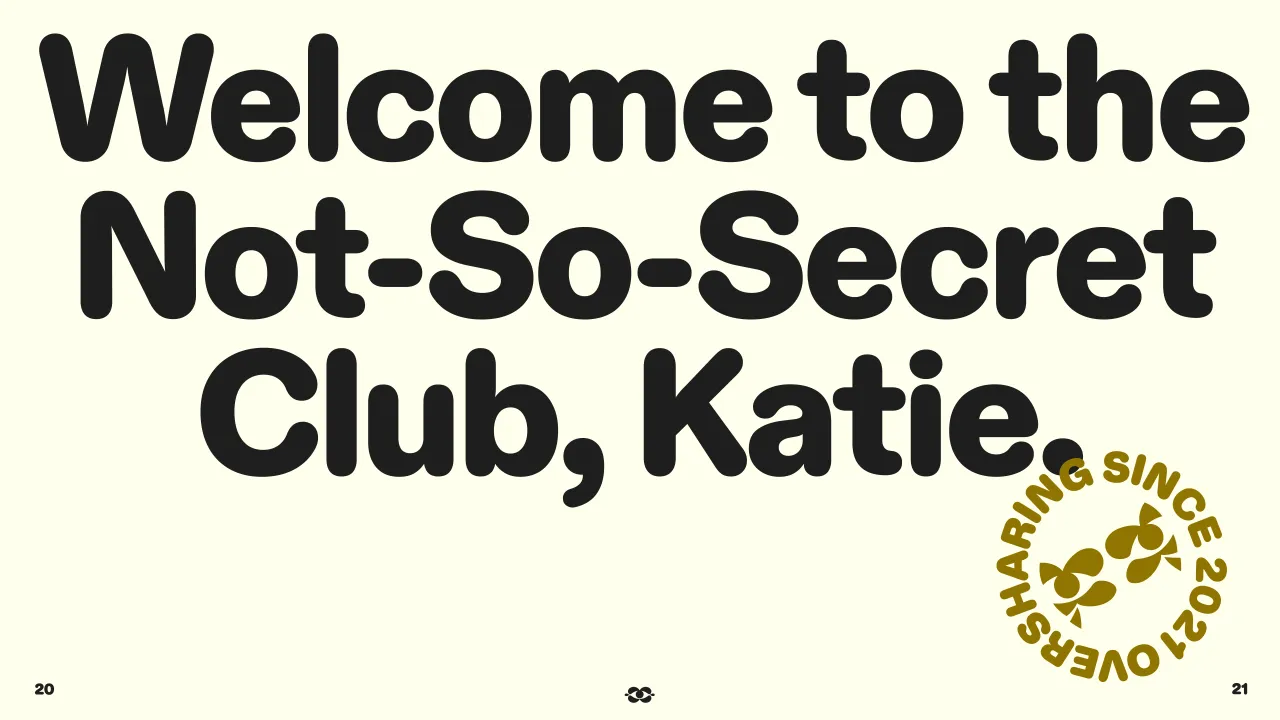
The visual identity turns the line, "make time dance", into a system full of warmth and movement. The palette is yellow and optimistic. Warm, curvy type and playful language add personality. Energetic motion slots in nicely. It all makes Franki feel alert, sociable, and ready for whatever's next.
At its heart sits a joyful symbol that works as visual shorthand for being in the know. Inspired by hallmarks and members' club crests, it's shorthand for being in the know. "The symbol can point towards a URL, flag a location or steer you towards your next experience. It can also step away from the wordmark entirely and become part of Franki's wider cast of characters, adding expression and direction across the product and communications.
The wordmark feels friendly with its curvy, playful forms. Diatype Rounded pops up across headlines and campaigns with its soft shapes. Bright yellow and gold lead the way, giving optimistic vibes and royal standards, while light yellow, off-white, pure white, and charcoal add contrast.
Motion keeps everything moving, with type, content, and UI opening, turning, and bouncing with quick, confident energy. We also like the lo-fi touches that keep it all human. The accompanying photography is warm and bright, often candid, with spontaneous interactions, shared plates, open laughter, and the small details that make a restaurant feel special. Energetic framing gives each image a sense of movement, while natural colour and light keep it all close to reality.
It comes together across product, content and communications, with the video-first app putting real people and real places front and centre. It also stretches into Franki Social Club, a programme that rewards creators for posting about their favourite restaurants and earning cash back when they order with a linked card.
Does it work?
The rebrand marks Franki's shift from discovery tool to community-led platform. It links the pleasure of finding a place to the reward of sharing it, and gives the app a confident base to grow from.
"Franki is trying to solve a very human problem: how to spend more of your time doing things you genuinely enjoy," says Gerald Torto, senior strategy director at Koto. "The opportunity was to make that utility feel joyful rather than transactional. 'Make time dance' gave the brand a clear strategic role, but also an emotional one. Franki helps people find their own beat, then invites them to share it with everyone else."
For executive creative director Melissa Baillache, the design had to match the product. "The identity needed to move with the same energy as the product," she says. "The logo became more than a signature. It morphs into a character that can guide, react and celebrate, giving Franki a clear emotional language across the product. Around it, type, colour, motion and imagery work as one lively system, making every interaction feel warm, intuitive and unmistakably Franki."
You can browse the full project over on Koto's case study.