How Risotto's refurb turned the humble filing cabinet into an expressive canvas
When Bisley partnered with Glasgow's Risotto Studio to furnish a new creative headquarters, the result was a masterclass in how colour and storage can transform the way people work.
All photos by Richard Gaston
There's perhaps no object less romantic in the history of the office than the filing cabinet. It sits in the corner. It holds things. Nobody photographs it. Nobody talks about it at design festivals. It is, by almost universal agreement, furniture as infrastructure. Necessary, neutral and entirely beside the point.
Gabriella Marcella, founder of Glasgow-based Risotto Studio, has a different view, though. And her new creative headquarters, furnished in collaboration with British manufacturer Bisley, makes the case forcefully.
A studio built as a statement
Risotto is, for the uninitiated, a design studio built around the risograph: a Japanese printing process that produces rich, slightly unpredictable colour through a stencil-based system originally designed for office document reproduction.
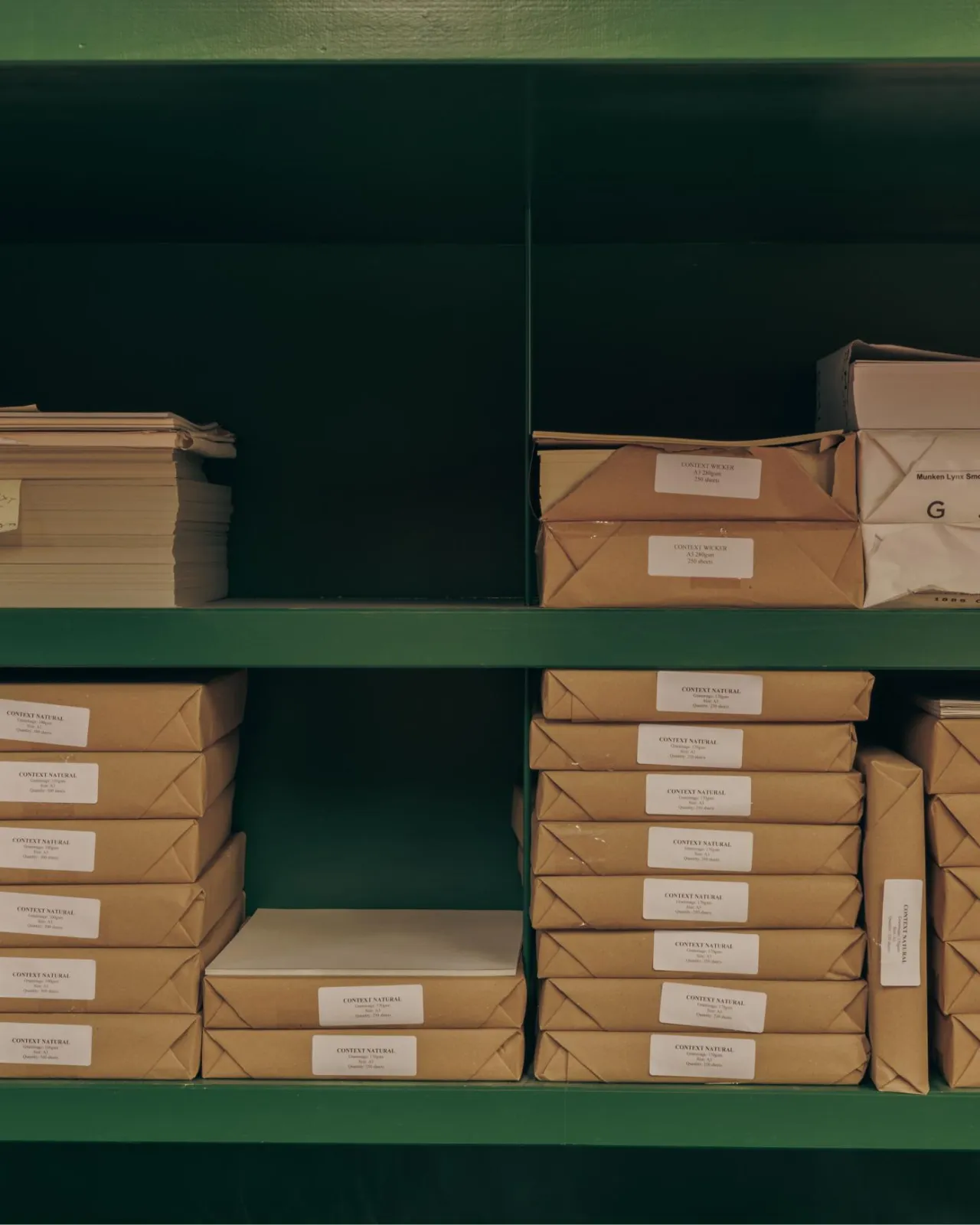
The risograph was never meant to be an art tool: it was meant to print newsletters and community notices. Risotto has spent years proving that the most creatively interesting things often start with the most utilitarian equipment. It's fitting, then, that its new Glasgow headquarters should take a similar approach to furniture.
The space functions as a working print studio, a creative hub, a workshop venue and an exhibition space. So the refurb needed to do a lot. It also needed to look like Risotto, which meant it needed to feel alive.
Bisley, founded in 1931 and now Europe's leading manufacturer of steel storage, was brought in to furnish it. On paper, this sounds like a facilities management decision. In practice, it produced one of the more visually arresting workspace interiors you're likely to see this year.
Colour as a design decision
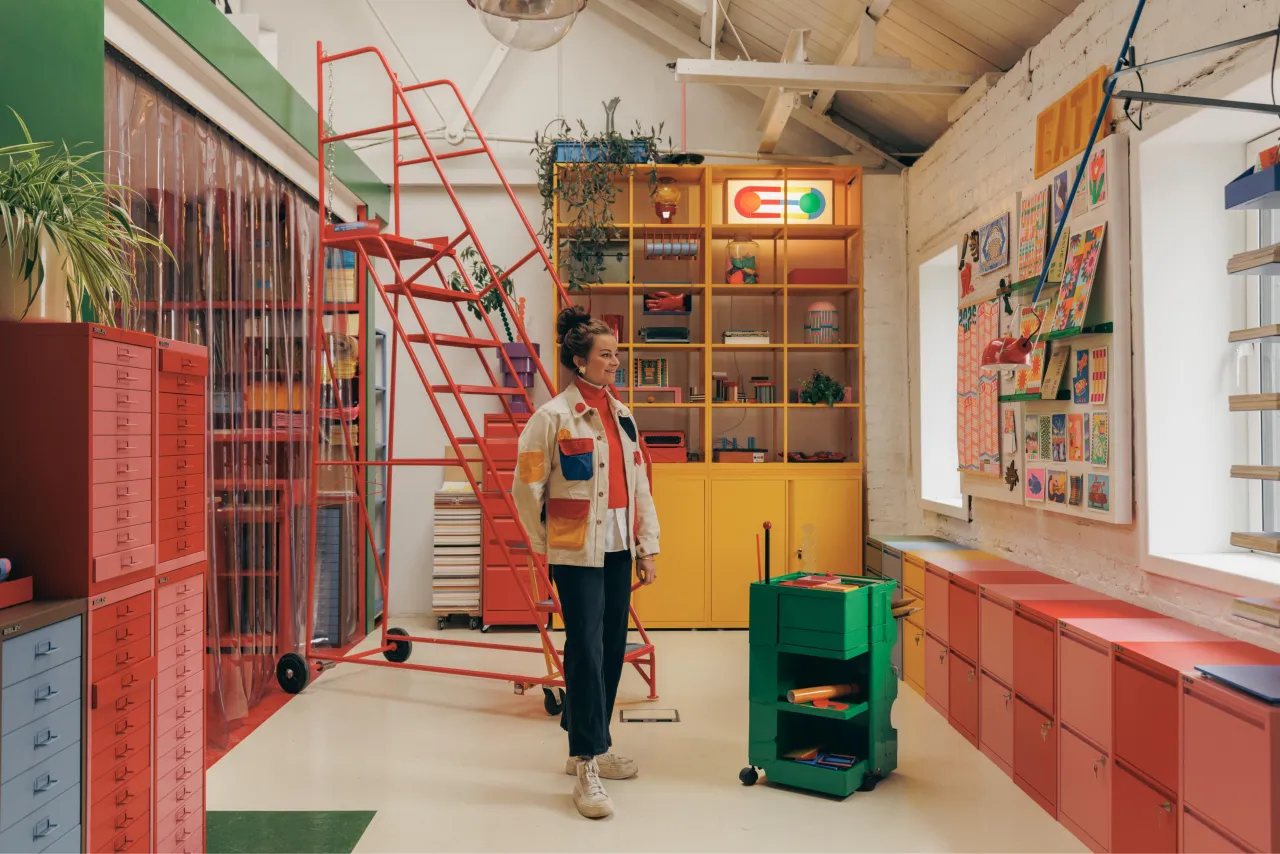
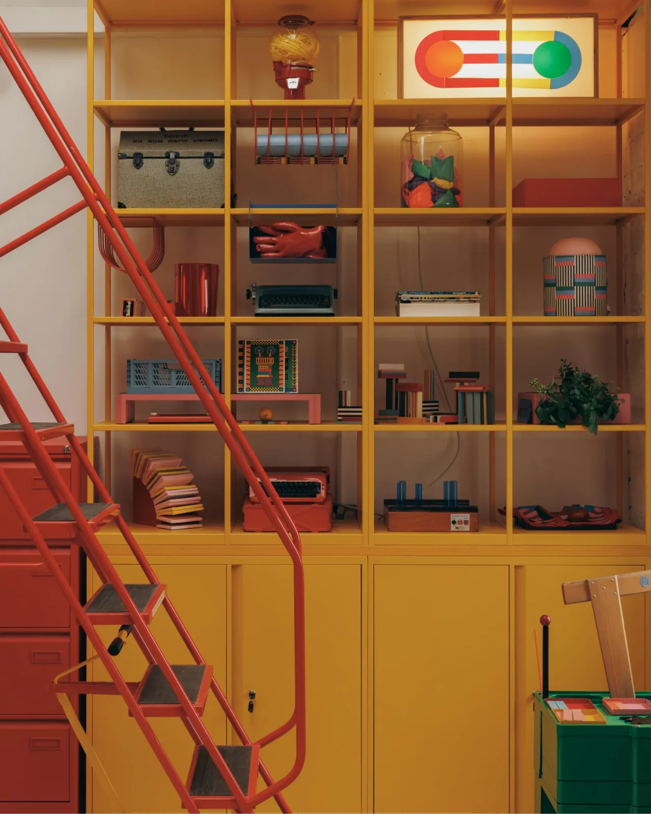
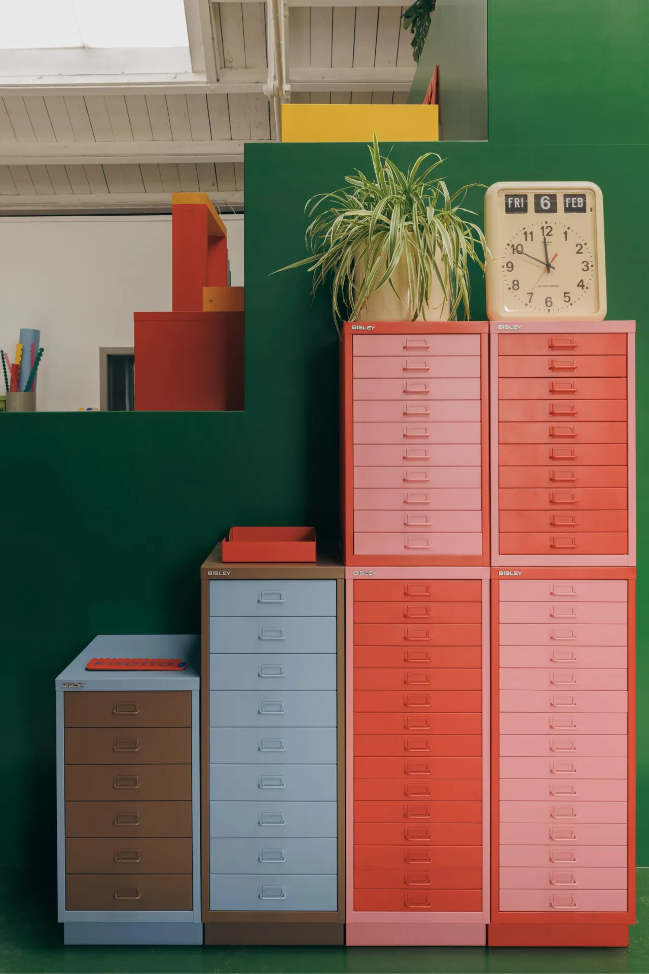
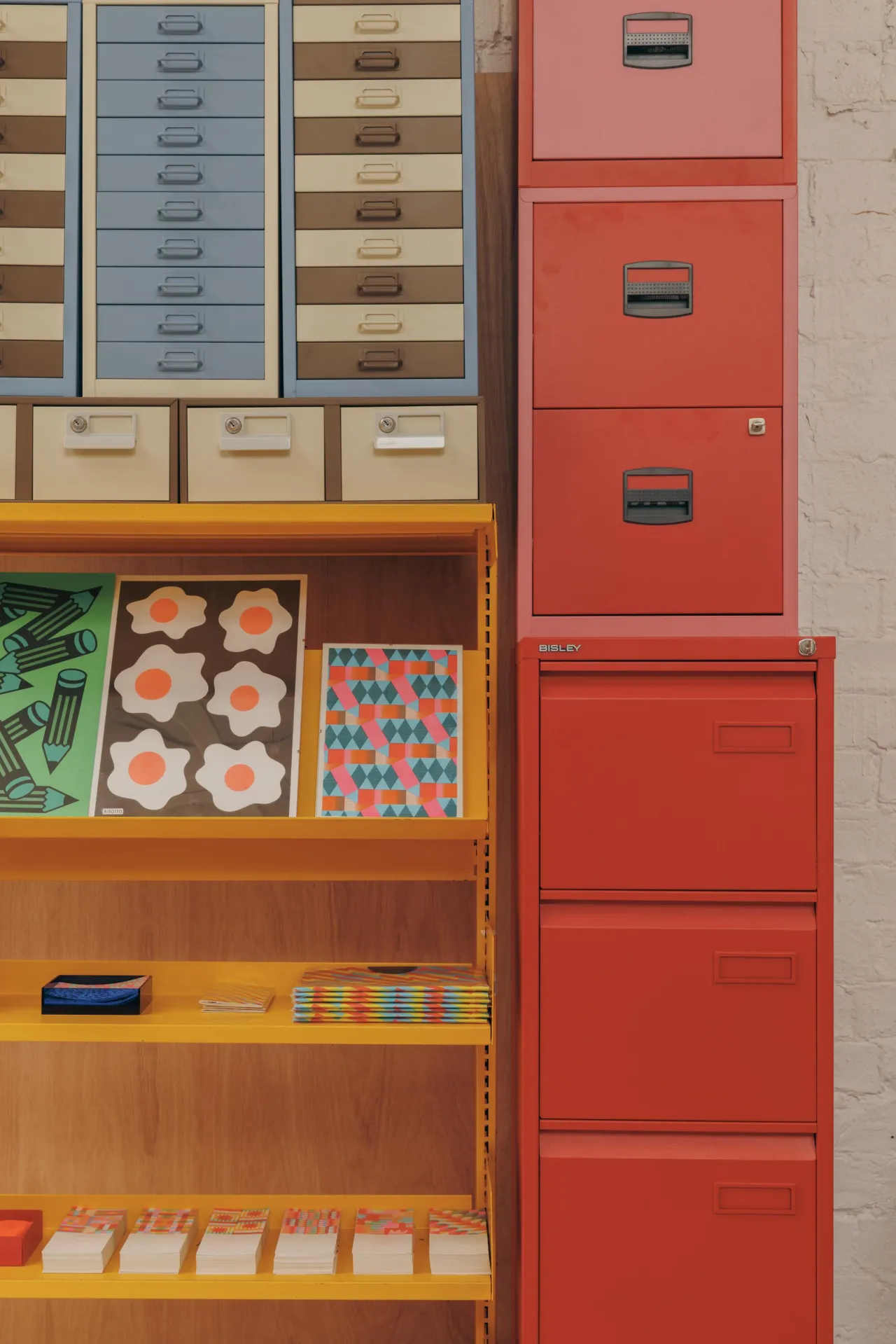
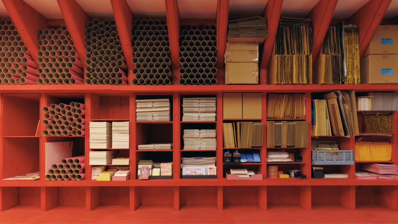
The first thing to understand about this collab is that the colour choices were not decorative; they were compositional. Marcella specified a mix of Bisley Blue, Bisley Pink, Cardinal Red, and Golden Sunflower Yellow across MultiDrawer units, LateralFile cabinets, Outline shelving, and classic filing cabinets, deliberately avoiding uniformity and treating each piece as part of a larger visual composition.
Alternating coloured drawers, contrasting product combinations and layered tones turn what would ordinarily be a storage specification into something closer to a site-specific installation. The classic Bisley Coffee and Cream finish appears on card filers throughout the space, a deliberate historical reference that sits in productive tension with the brighter, bolder pieces around it.
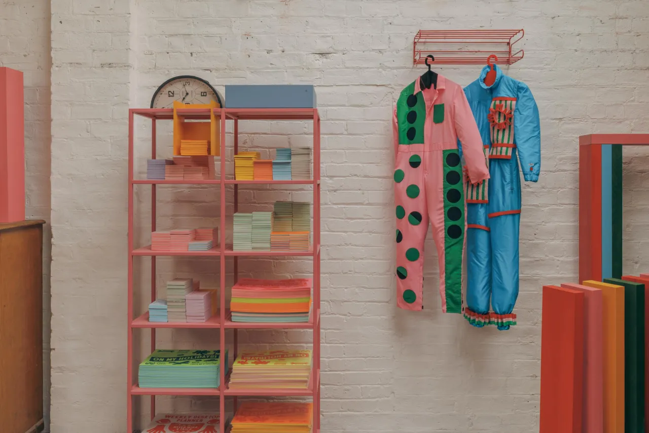
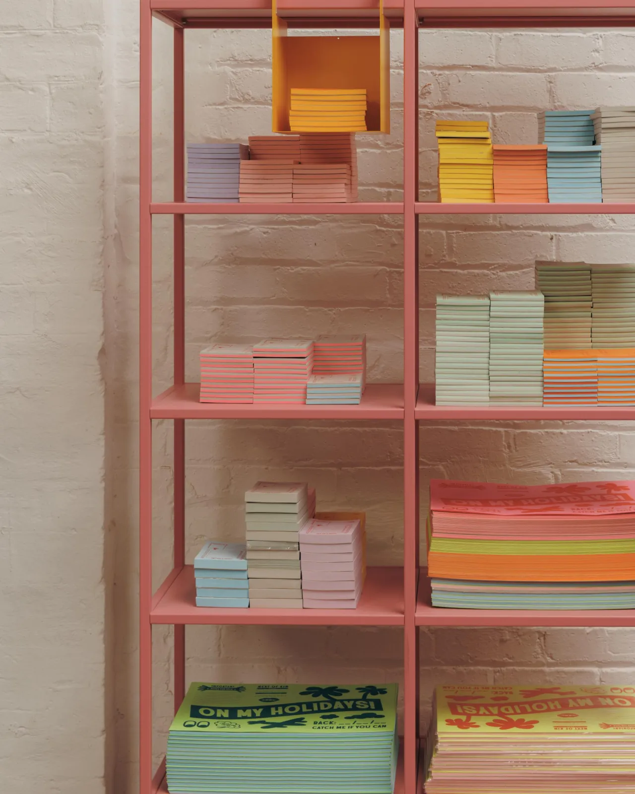
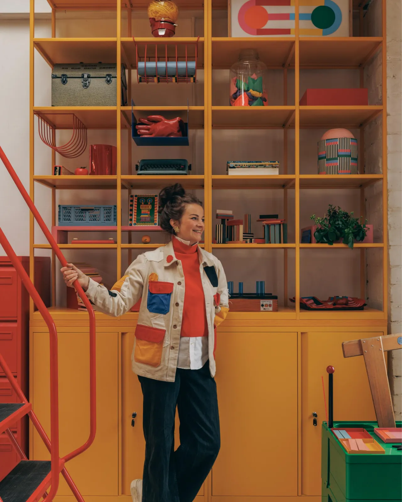
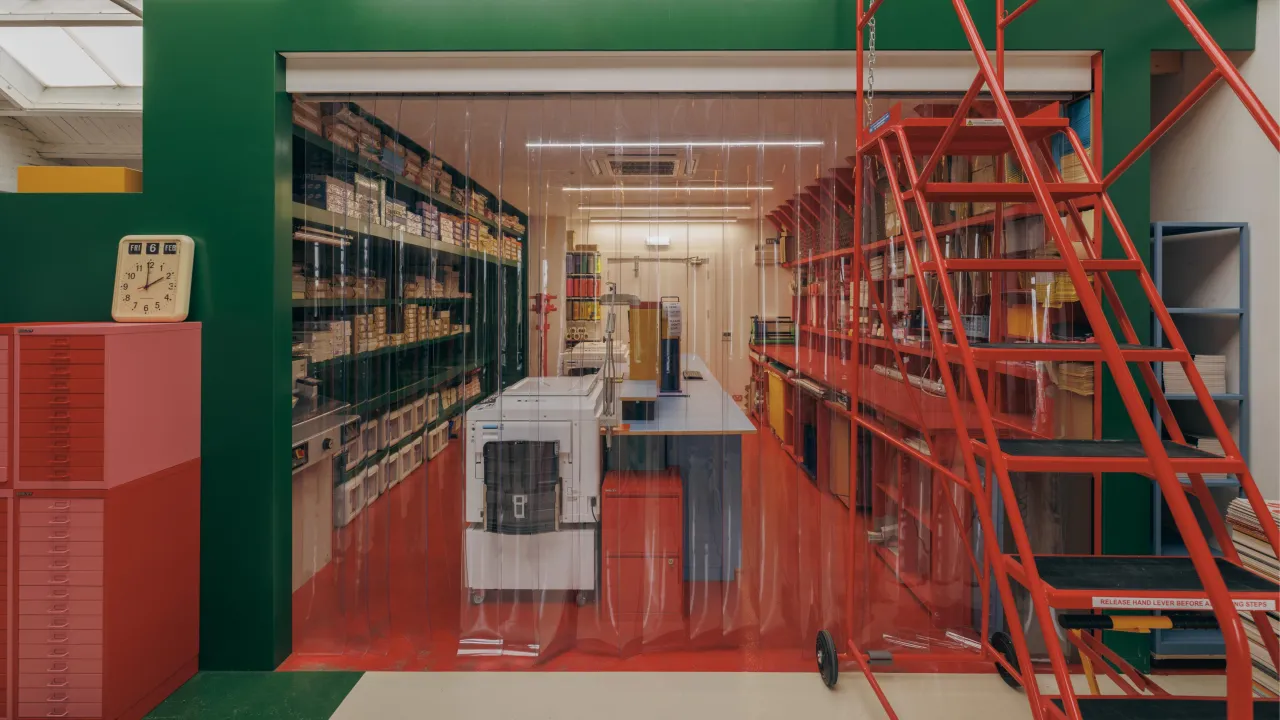
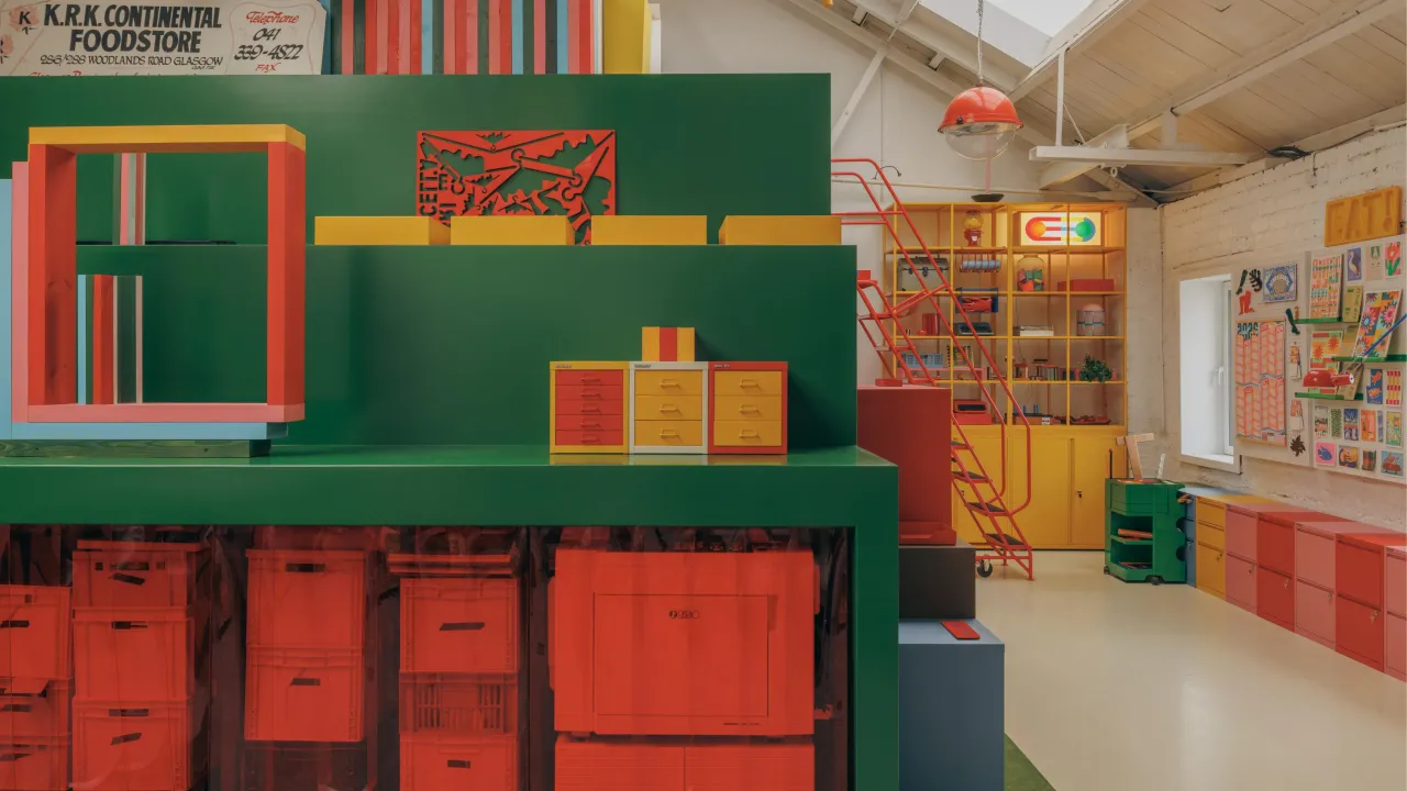
This isn't colour for colour's sake. Marcella's graphic design practice is built on a deep understanding of how colour functions emotionally and spatially, how it creates energy or calm, how it guides attention and shapes mood. "Welcoming people into my own design world is a key part of this experience," she says. "I want to share my passion for colour, process and the positive impact it can have on our lives."
That ambition is what elevates this project beyond a well-photographed office fit-out. The studio is designed to be inhabited, to be worked in, to be a place where the environment actively supports and inspires the making of things.
The Bisley paradox
There's something quietly subversive about using Bisley's standard product palette to achieve this effect. These are not bespoke, custom-lacquered pieces. They are catalogue products, available to anyone, specified in finishes that Bisley has offered for years. The transformation comes not from the products themselves but from how they've been combined, configured and understood.
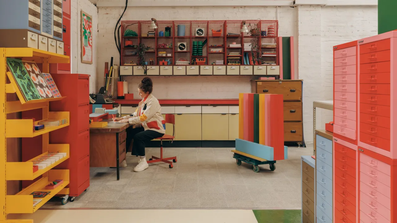
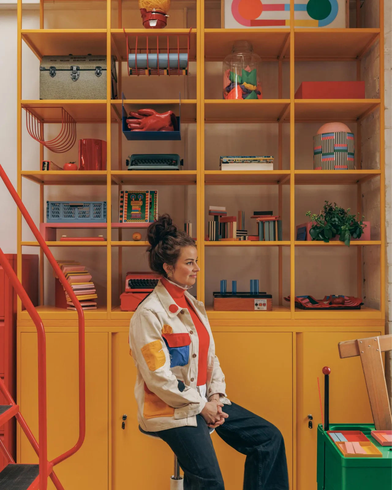
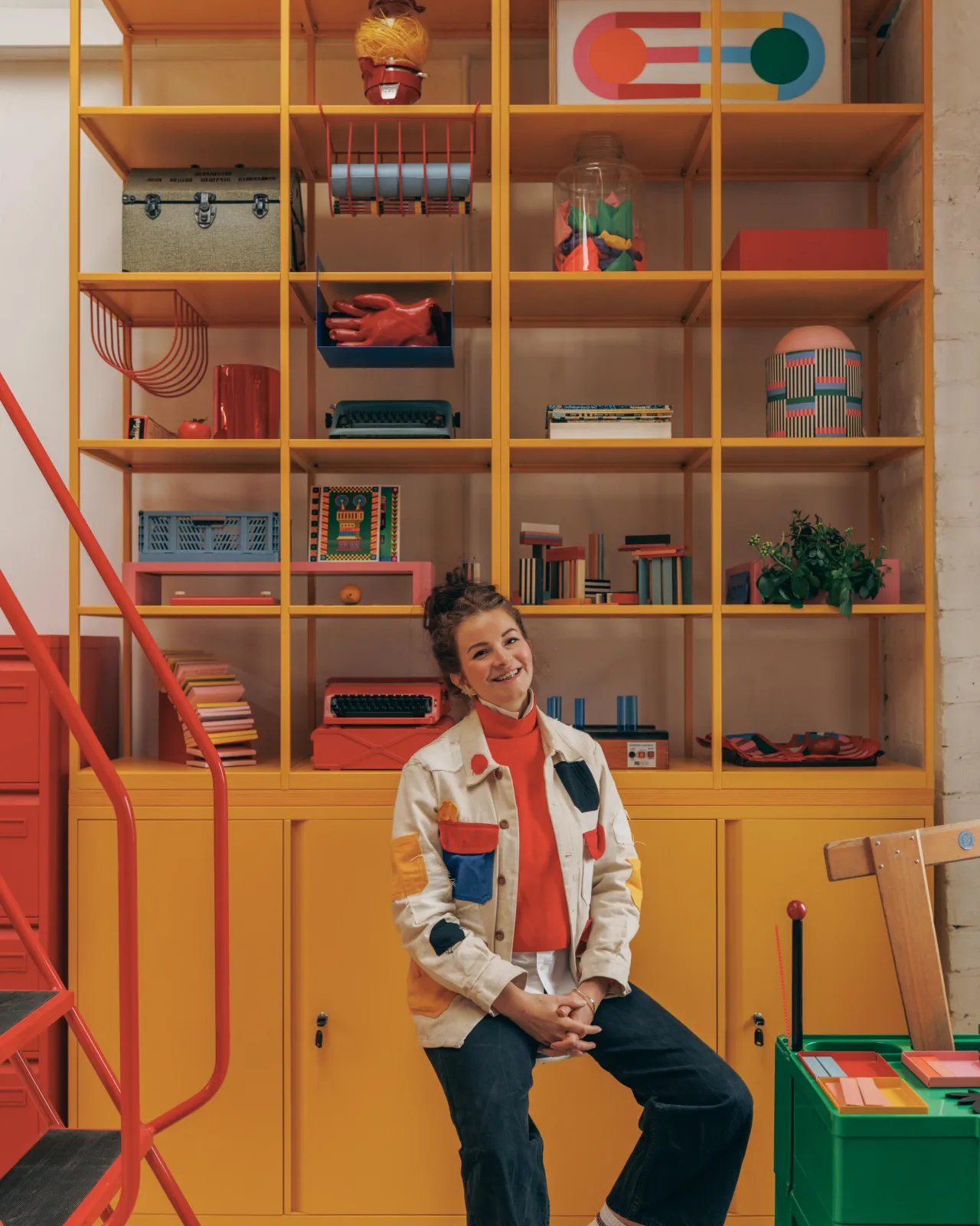
It's all a useful lesson for any designer working with furniture in commercial or creative environments. The limitation of a standard palette, the constraint of working with what exists rather than commissioning something new, can force a more considered and ultimately more interesting set of decisions. Marcella did not need custom colours. She needed to look at the standard range differently.
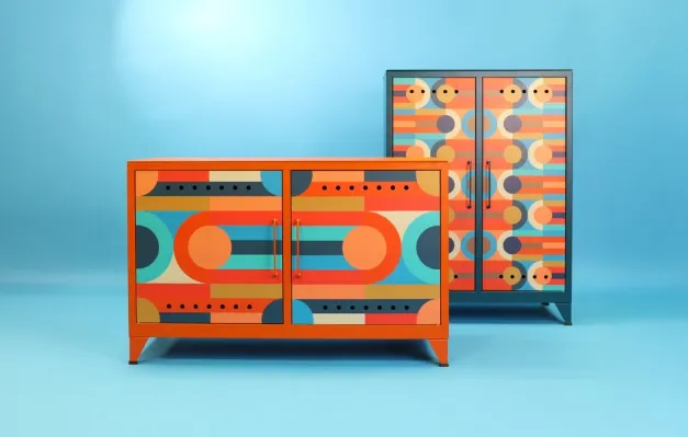
The collaboration, by the way, has a longer history than this single installation. The first phase, unveiled at Clerkenwell Design Week in 2025, saw Bisley classics, including Fern units and the MultiDrawer collection, reimagined with Risotto's printed steel finishes, featuring Marcella's geometric Tetris pattern applied directly to the surface of the furniture. That project brought the graphic language of Risotto onto the product. This one brings it into the space, which is a different and in some ways more demanding challenge.
Making and showing, together
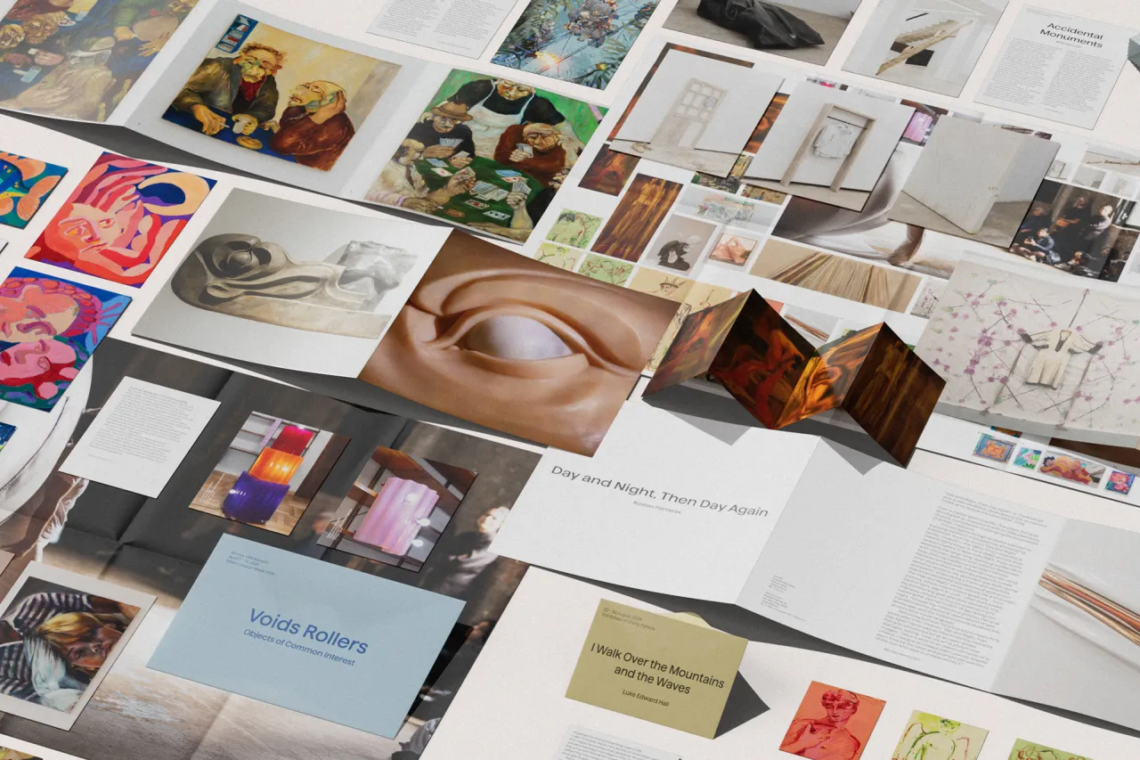
The new headquarters opened alongside Riso Club 100, an exhibition at The Glue Factory Galleries in Glasgow celebrating the 100th issue of Risotto's not-for-profit postcard subscription project. The show features over 400 risograph designs from contributors from Bogotá, Damascus, Ahmedabad, Philadelphia, Melbourne and São Paulo.
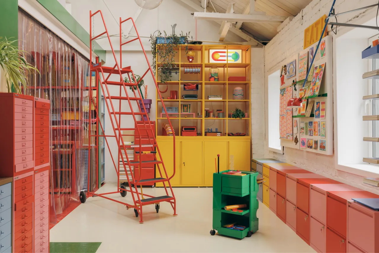
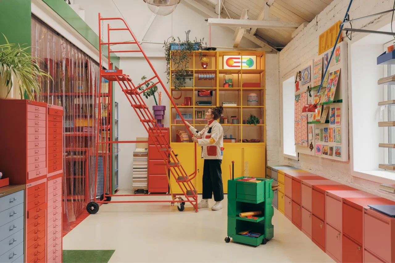
This is not coincidental. Risotto has always been as much about community and access as it is about aesthetics, about making risograph printing available to artists who might not otherwise encounter it, about publishing work from places that are underrepresented in design conversations. The physical headquarters is the permanent home for that mission, and it needs to feel generous and open, not precious or intimidating.
Key takeaway
The key takeaway here is one that creatives have been making for years, but rarely with such photogenic evidence. The environment you work in is not separate from the work you produce. It shapes your thinking, your mood, your appetite for risk and experimentation. A space designed with the same care and intentionality as the work it houses will, over time, produce better work.
That doesn't mean every studio needs to look like Risotto. It means the decisions you make about your physical environment, including the unglamorous ones about storage, are worth taking seriously. Even the filing cabinet.